Below are links to visualizations I created of the GridLAB-D "taxonomy feeders" using Graphviz and glm2dot, a ruby script I wrote to translate .glm (GridLAB-D) files into DOT files that can be laid out by Graphviz. In the spirit of the GridLAB-D licensing terms, I'm releasing these under the Creative Commons "CC BY 3.0" license; that is, you're free to use the images in the pdfs for whatever you like (including commercial purposes) as long as you credit me by name (Michael A. Cohen) and/or linking to this page.
I created these images while working on a project with my advisor Duncan Callaway to examine the impact of distributed photovoltaic (solar) power on the electrical distribution system. We're grateful to SolarCity for collaborating with us on this project and the California Solar Initiative RD&D program for their financial support.
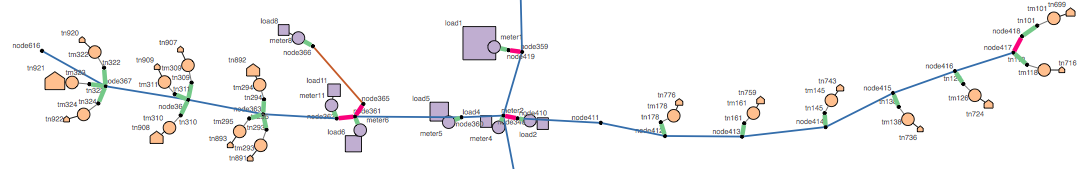
| GridLAB-D object | Graph representation | Notes |
|---|---|---|
| Overhead line | Thin blue line | Length of individual segments is roughly to scale |
| Underground line | Thin brown line | |
| Node, plain triplex node | Black dot | |
| Swing bus node | Magenta double octagon | Looks a bit like a bullseye |
| Triplex node with real power demand | Orange house | Area is proportional to peak real power demand (same scale as load) |
| Capacitor | Green double circle | |
| Fuse | Short magenta line | |
| Load | Lavender square | Area is proportional to peak real power demand (same scale as triplex node) |
| Meter | Lavender circle | |
| Recloser | Short gray line flanked by magenta | |
| Regulator | Short gray line flanked by green | |
| Switch | Short yellow line | |
| Transformer | Short green line | |
| Triplex line | Thin gray line | |
| Triplex meter | Orange circle |
.glm node names. So, e.g. R1-12-47-3_node_35 becomes node35. I have not labeled the edge-like elements as the graph felt busy enough with just the node names..glm file..glm files contain no information about angles or absolute positions, the overall spatial arrangement of the nodes is arbitrarily determined by Graphviz (with the constraint that the individual segment lengths are preserved)..glm files to DOT, please contact me at macohen@berk_DropThisPart_eley.edu. As you can see, I've chosen to display a fairly limited set of information from the .glm files in the graphs; there's a lot more that could be done with it.The graph files are presented below in two formats. The .pdf files contain visual representations of the feeders; these are generally the best place to start. The .dot files contain the “Attributed DOT Format” (text) output from Graphviz with coordinates attached to each object (in the pos property); these can be useful if you'd like to use the numerical coordinates in some other software, like GIS. See Drawing graphs with dot for documentation of the file format. Note in particular that the pos coordinates are in units of printers‘ points. There are 72 points in an inch, and the layouts were prepared at a scale of 1 inch = 200 ft, so:
real world feet = point coordinate / 72.0 * 200.0
Of course, the origin point for each layout is arbitrary since we don't know the true physical location (or orientation) of the taxonomy feeders.
Last updated 2013-10-03